• Home
  • FAQs
  • Status
  • Submit a request
  • Sign in
  1. Realeyes
  2. FAQ
  3. Dashboard - Charts

Dashboard - Charts

Follow New articles New articles and comments

  • Can I compare the trend lines of multiple videos on a single chart?

    Yes, you can select multiple videos within any study and compare the trend lines for any of the emotions. 

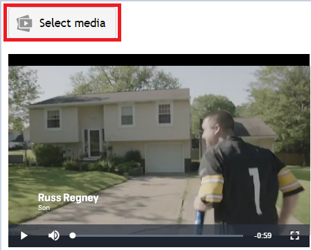
    To do so, click the “select media” button above the video.


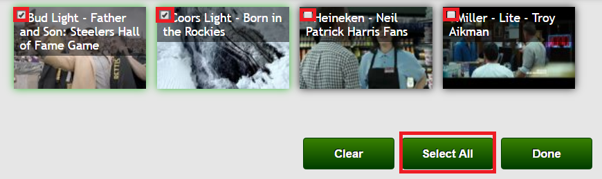
    This will bring up a pop-up with all of the videos in your study.  You can select as many as you would like by clicking on the checkboxes.  You also have the option to “select all” if you want to see the data for every video at the same time.  Click “done” once the videos of interest have been selected.


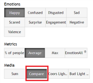
    Next, click on the “compare” button under the Media filter and select the specific emotion(s) you want to analyze.

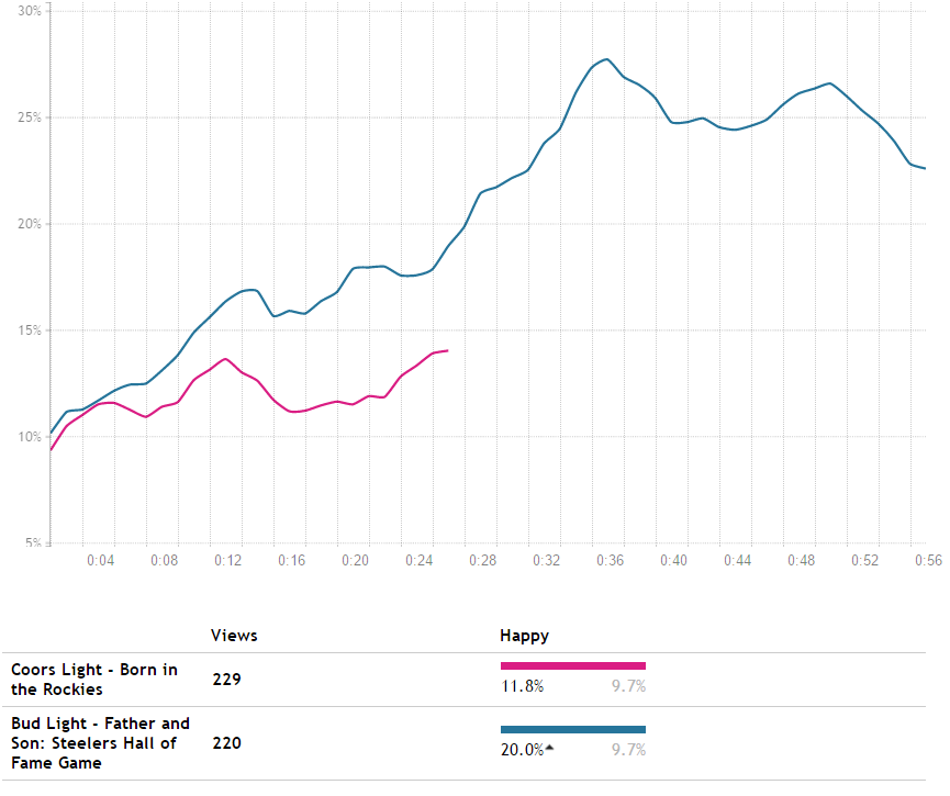
    Once selected, the chart will update and allow you to visually see the differences for all of the selected videos.

    If there are videos you have tested that are not included in the same study on the dashboard but you need to compare on the same chart, please reach out to support@realeyesit.com and we would be happy to combine any videos into the same study.

    Was this article helpful?
    0 out of 0 found this helpful
    Read more
  • How do I read/interpret the information in a chart?

    The charts tab is used to display graphs of different emotional data for a study’s video(s).  The data that is displayed in the charts is customizable by Emotions, Metrics, Attention, Survey Metrics (available for Pro and Standard study), Realeyes Score, Realeyes Score Components, Gender, Age, Device, and any additional survey questions that may have been asked. For more information and interpretation of our Metrics, read here.

    Dashboard_charts.PNG

    The charts page allows you to select different combinations from the available filters depending on how you would like to analyze the data. Any selected option will then be displayed in the chart.

    The x-axis (highlighted blue) on the chart represents time in second by second increments for the selected video(s) duration.

    The y-axis (highlighted red) on the chart indicates the percentage of people expressing the chosen emotion(s) at a given time.

    To view the exact percentage of emotion expressed at any given time, hover your cursor over the desired point in the chart.


    For example, in the above chart, the Emotion “Happy” is being looked at second-by-second for the entire duration of the video.  If you wanted to look at the percentage of “Happy” at 42 seconds in the video, you would hover over the 42 second mark which indicates 32.3%.

    The charts page is a great place to splice up the data into different segments and to analyze different emotions, metrics, and other variables.  It is an interactive and visual way to see any trends and key moments for the media.


    Was this article helpful?
    0 out of 0 found this helpful
    Read more
  • How do I recreate dashboard charts using Excel?

    It is possible to customize the dashboard charts in your own style by recreating them in Excel. To do this, you will simply need to use our export 'Chart Data' function to export the raw data.

    The exported data will match exactly what is displayed on the dashboard chart at the time of export. Because of this, you will need to make sure all of the correct filters are selected before exporting.  For instance, if you would like to recreate the chart for 'Happy', you will need to make sure ‘Happy’ is selected under the emotions filter. 


    One thing to be aware of is that the exported data is smoothed to a certain extent. You can change the smoothing level under the ‘Chart views’ tab – whichever level is selected will be applied in the export. You can learn more about smoothing here. 

    The data export will include a single column for each line that was displayed on the dashboard at the time of export. The exported data shows the % of people showing the selected emotion(s) at each second (the Y axis). The final step before using the Excel chart function is to add in a single column for the duration of the video(s) in seconds (the X axis).

    Attached below is an example of how you can use the data exports to recreate the charts from the Dashboard. The file includes the Happy, Engagement, and Negative traces for an ad combined in a single chart for direct comparison. 


    Was this article helpful?
    0 out of 0 found this helpful
    Read more
  • What is smoothing?

    Smoothing is used to approximate the data to allow for easier pattern recognition while simultaneously reducing the noise of the data set. Furthermore, people react emotionally at different speeds, so one person might react 0.2 seconds after the event, while another might take up to a second. Low levels of smoothing counteract this.

    When you first visit a project page, the data has already been smoothed by a small factor, depending on various details such as the length of the media. If you select ‘Chart views’ you will see the graphs are by default presented with a smoothing number >1. We use a moving point average when charting a smoothed line. So, for example, if smoothing=3, averages of 3 consecutive seconds are used for each data point that is plotted. 

    To change the smoothing level, select the 'Chart Views' tab as indicated in the image below. The slider can then be used to make adjustments.

    Please note, when using the export function, the exported data will be automatically smoothed to the selected level. To export the raw data, set the smoothing level to 1.

    Was this article helpful?
    0 out of 0 found this helpful
    Read more
  • Can I tailor my demographic segments?

    Yes. 

    All metrics and charts can be tailored to your demographic requirements – from age and gender, to income, to purchase intent, and so on, in order to best answer your research questions.

    Was this article helpful?
    0 out of 0 found this helpful
    Read more
  • Is there a minimum of required sessions to segment the data?

    Yes. 

    We recommend a minimum of 50 high-quality sessions per segment for statistically significant results.

    Was this article helpful?
    1 out of 1 found this helpful
    Read more
  • Can I view individual participant results?

    No. 

    Our platform is quantitative rather than qualitative. We aggregate all study to create a repeatable emotional trace, so results cannot be presented individually.

    Furthermore, we have strict policies regarding the confidentiality of participant data, and therefore cannot share individual level data.

    Was this article helpful?
    0 out of 0 found this helpful
    Read more
  • Can I view the webcam footage?

    No. 

    The webcam recordings are not part our deliverables. Sharing the footage we collect is strictly forbidden by our internal privacy policy and several international laws regulating how the data we work with must be handled. 

    Was this article helpful?
    0 out of 0 found this helpful
    Read more
  • Can I export the raw study data?

    Yes. 

    You can export all the data required to easily recreate the results’ graphs and charts in your presentations. Read Here for more detail information on how to export data on the dashboard. 

    Was this article helpful?
    0 out of 0 found this helpful
    Read more