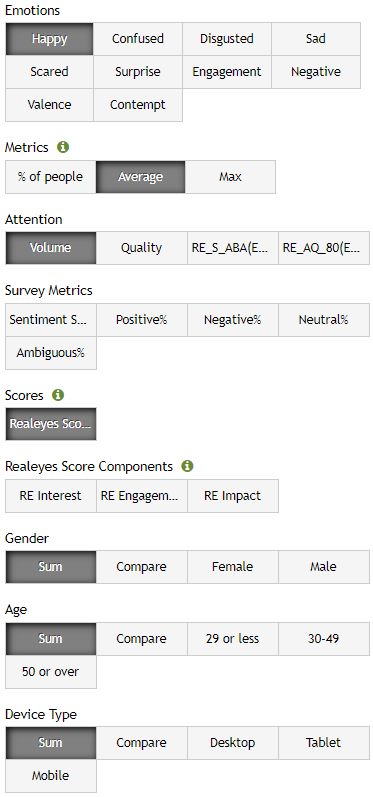
The charts tab is used to display graphs of different emotional data for a study’s video(s). The data that is displayed in the charts is customizable by Emotions, Metrics, Attention, Survey Metrics (available for Pro and Standard study), Realeyes Score, Realeyes Score Components, Gender, Age, Device, and any additional survey questions that may have been asked. For more information and interpretation of our Metrics, read here.
The charts page allows you to select different combinations from the available filters depending on how you would like to analyze the data. Any selected option will then be displayed in the chart.
The x-axis (highlighted blue) on the chart represents time in second by second increments for the selected video(s) duration.
The y-axis (highlighted red) on the chart indicates the percentage of people expressing the chosen emotion(s) at a given time.
To view the exact percentage of emotion expressed at any given time, hover your cursor over the desired point in the chart.
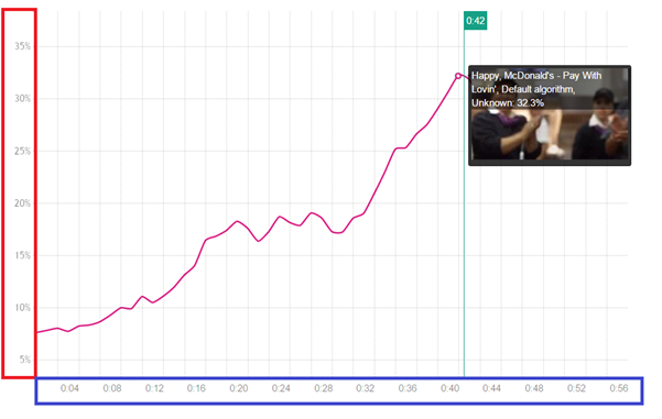
For example, in the above chart, the Emotion “Happy” is being looked at second-by-second for the entire duration of the video. If you wanted to look at the percentage of “Happy” at 42 seconds in the video, you would hover over the 42 second mark which indicates 32.3%.
The charts page is a great place to splice up the data into different segments and to analyze different emotions, metrics, and other variables. It is an interactive and visual way to see any trends and key moments for the media.
0 Comments